Overview
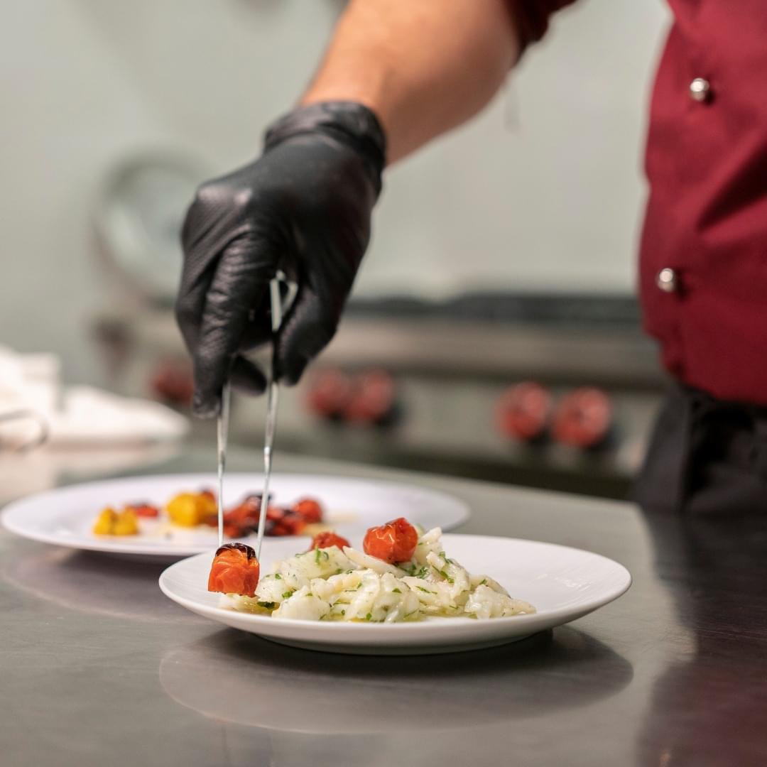
When Luciano reached out to me, he was ready to turn the page. His restaurant, once known as Lucky Food, had served its community well — but it no longer reflected who he truly was. He wanted something more personal, more Italian, and above all, more sincere. His goal was to elevate the brand, making it more elegant and professional, without losing the warmth of family and the essence of Calabrian tradition.
Rebranding
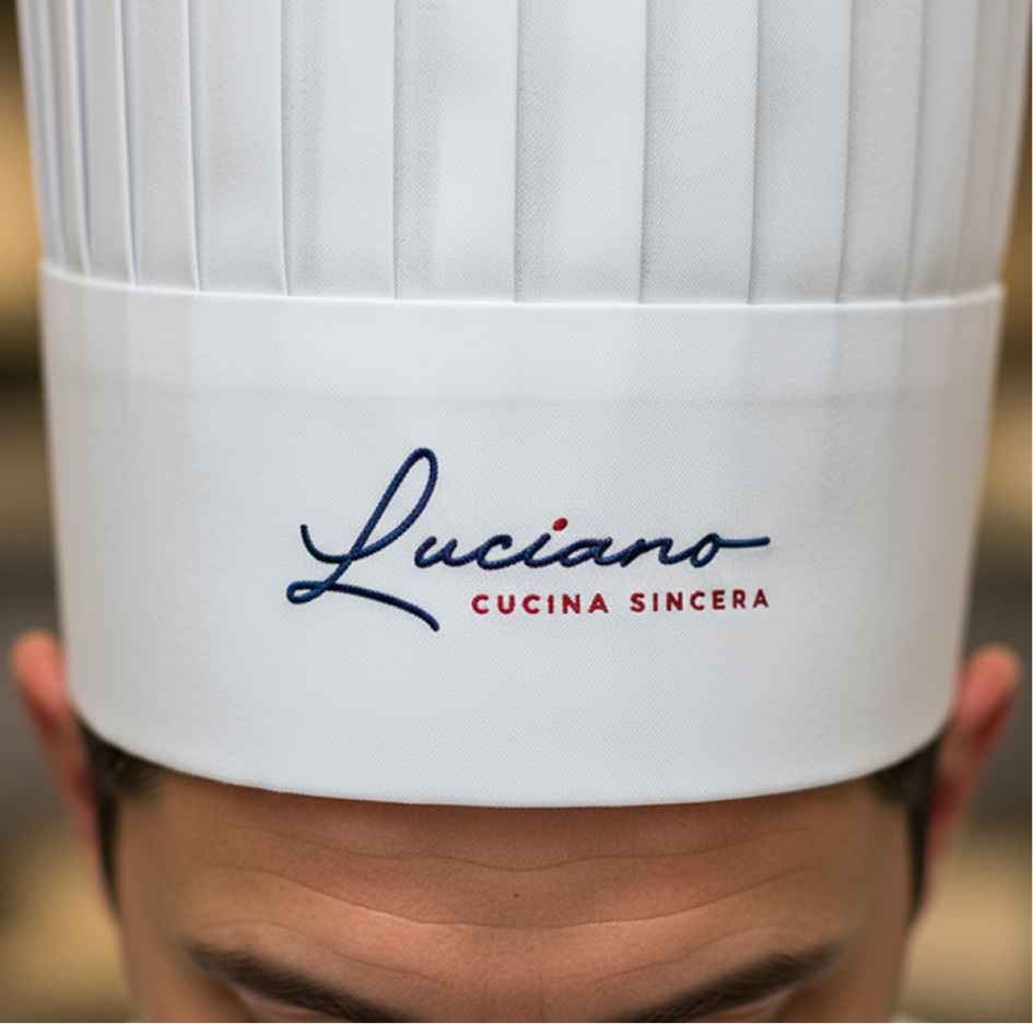
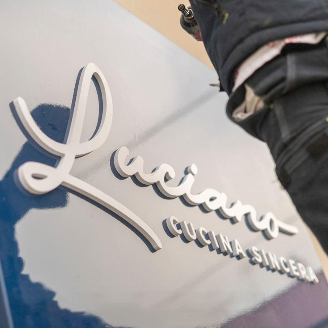
From our first conversation, I could feel the passion behind every dish he described — simple, honest food made with love. That’s when the idea of a handwritten logo came to life: something elegant yet human, as if Luciano himself had signed each plate leaving the kitchen. After exploring different styles, I refined one that felt just right — authentic, handcrafted, and full of character.
The logo features a handwritten typeface, adding a personal touch as if Luciano were signing each dish. The “L” evokes both strands of spaghetti and gentle sea waves, blending culinary artistry with elegance. A small drop above the “i” adds a distinctive flourish, symbolising a drop of sauce, wine, or any essential ingredient reinforcing the restaurant’s authentic, hands-on spirit.
Concept
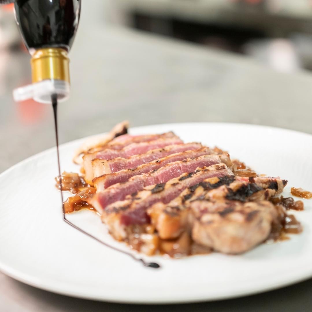
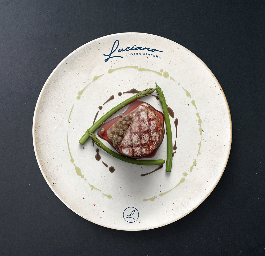
When defining the colour palette, I drew inspiration from Luciano’s menu, which beautifully balanced dishes from both land and sea. Deep red and navy blue became the main tones, one evoking passion and earth, the other calm and the sea, while a warm beige added a sense of refinement and harmony to the brand.
Colours
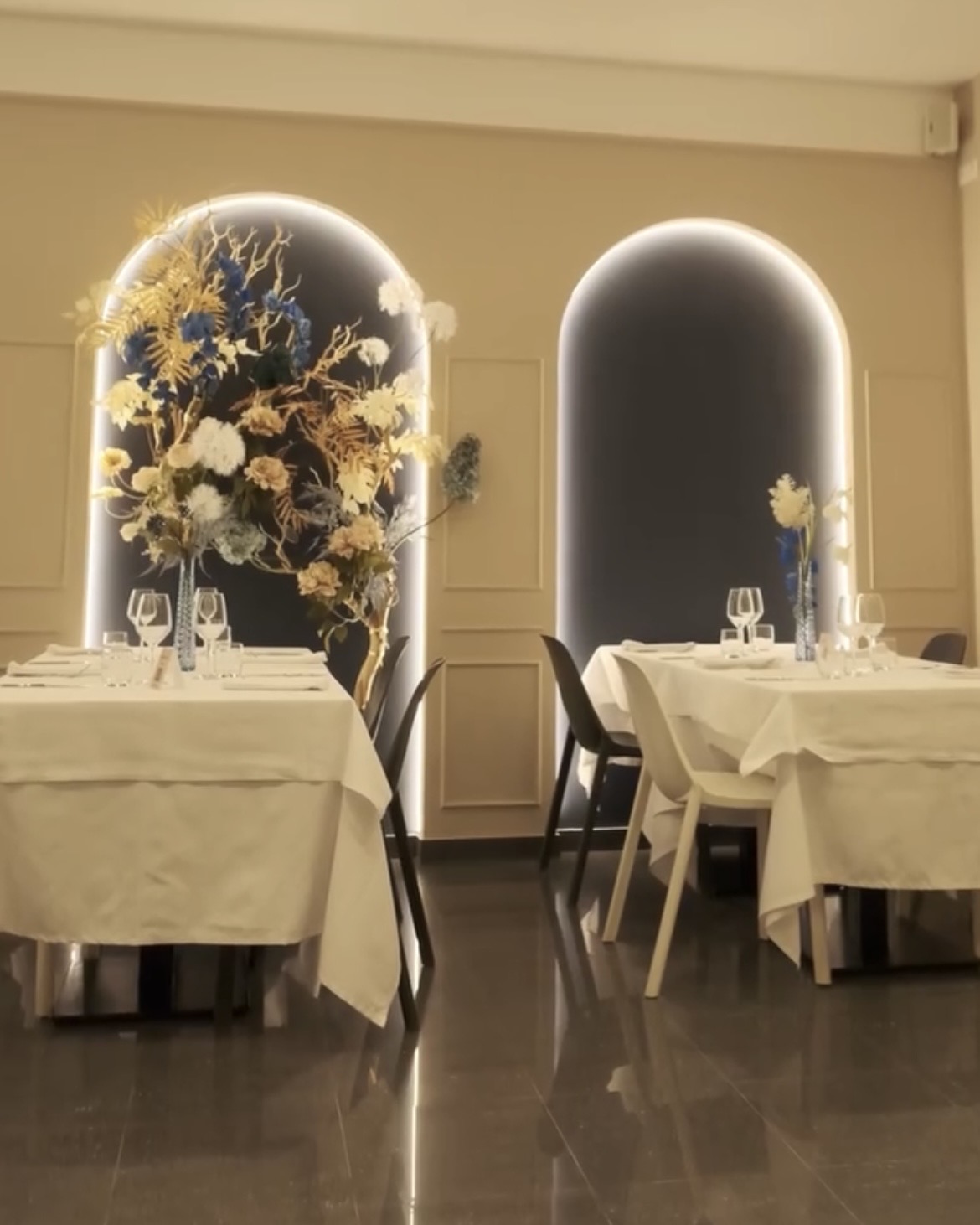
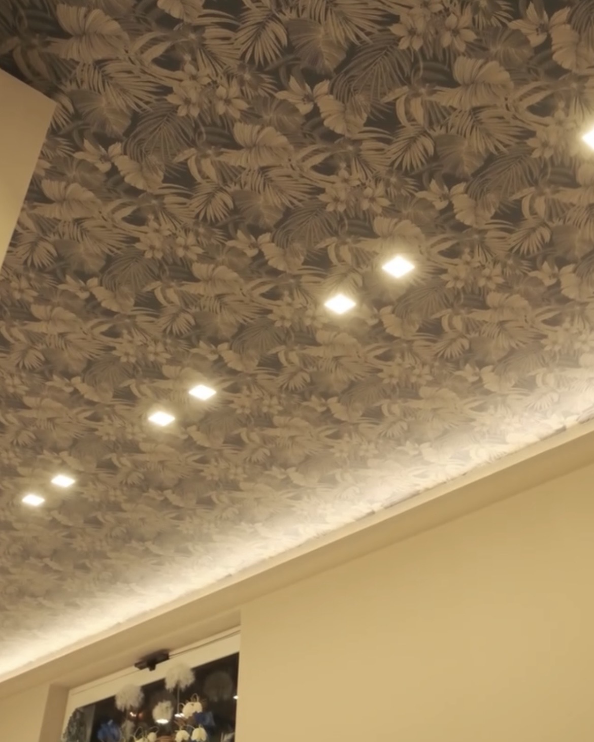
As the visual identity took shape, I worked closely with Luciano and Federica to extend the brand into the restaurant’s interior. Together, we selected wallpaper, paint, and decorations that echoed the brand’s soul — warm, welcoming, and unmistakably Italian.
The rebrand of Luciano – Cucina Sincera is more than a visual transformation, it’s the story of a family reclaiming its true identity through design, tradition, and heart.
Results