Edil Advisor is a tool for discovering, comparing, and choosing construction professionals with confidence.

Overview
When designing the EdilAdvisor logo, the aim was to merge two key concepts: construction (edilizia) and feedback/reviews (advisor). The challenge was to create a memorable, minimal, and modern symbol that instantly communicates the platform’s purpose.

Rebranding
Through an exploration of visual metaphors, I developed a pictogram that cleverly combines the shape of a house (representing construction) with a speech bubble (symbolising advice and feedback). This ensures the logo effectively conveys the brand’s core values—trust, expertise, and accessibility.

The design features a clean, geometric structure that enhances clarity and recognisability across all sizes and applications. The red and black colour scheme is inspired by construction signage, providing high visibility and a strong association with the industry.
Application

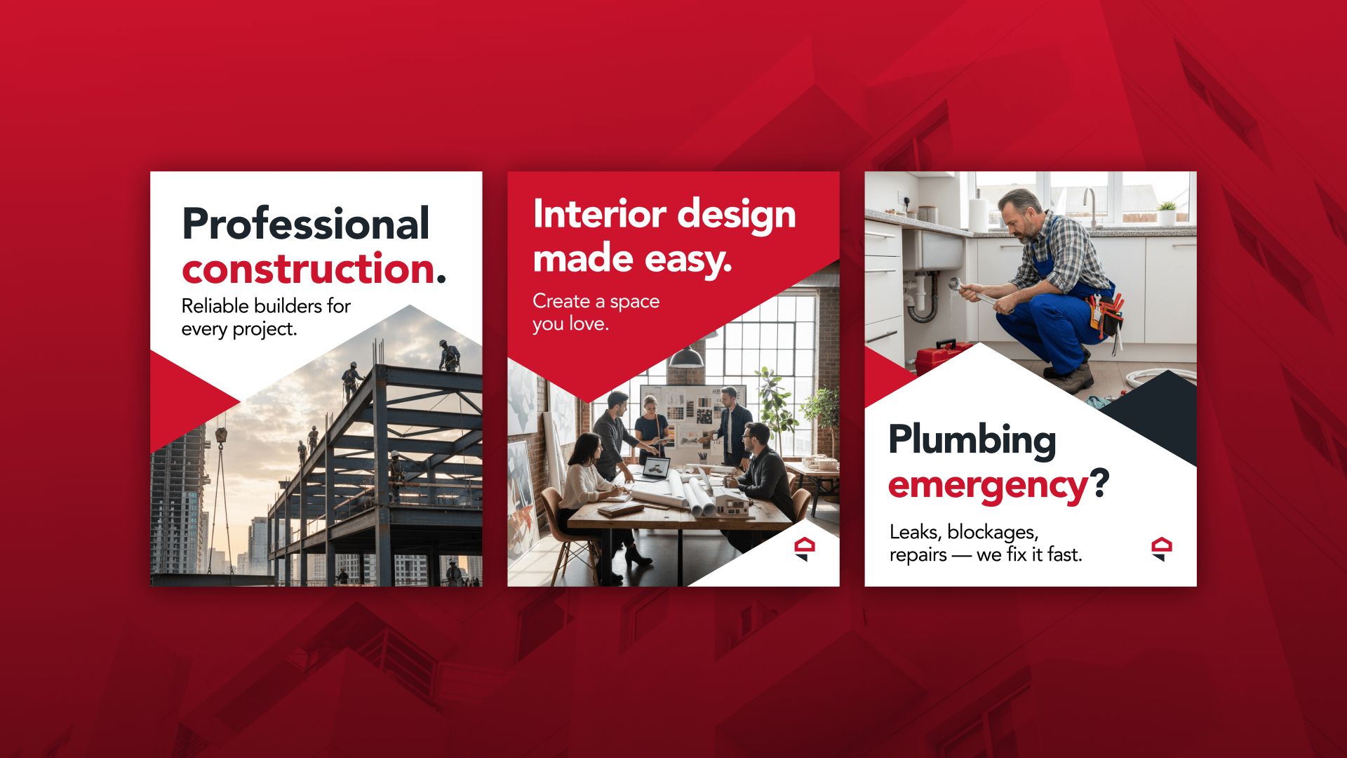
The typography balances bold, solid lettering for “EDIL” to emphasise the construction aspect, while “ADVISOR” is set in a sleek, modern typeface to highlight professionalism and guidance. This combination reinforces EdilAdvisor as a strong and trustworthy platform for users.
Results

A key focus was ensuring the logo’s scalability and adaptability across various media, from digital platforms to printed materials. The pictogram functions independently, making it ideal for app icons, social media, and other branding applications.
Results


Final Result
The full logo version seamlessly integrates the brand name while maintaining a cohesive visual identity. The result is a dynamic and versatile brand identity that effectively positions EdilAdvisor as a leader in the construction advisory sector.


